Fitz & Co I started with rebranding of the company. We created the brand mark in simple sans-serif logotype that emphasizes the idea of edge and centrifugal force. The outward movement of the logomark, comments on the nature of their business. And the idea of edge, showcases their expertise in art and their pursuit towards innovation. We used a strong navy blue to show trust and friendliness. The identity was applied to stationary, presentation decks and an entire brand manual. Now, we are extending this language into their website.
View live site fitzandco.art
View live site fitzandco.art
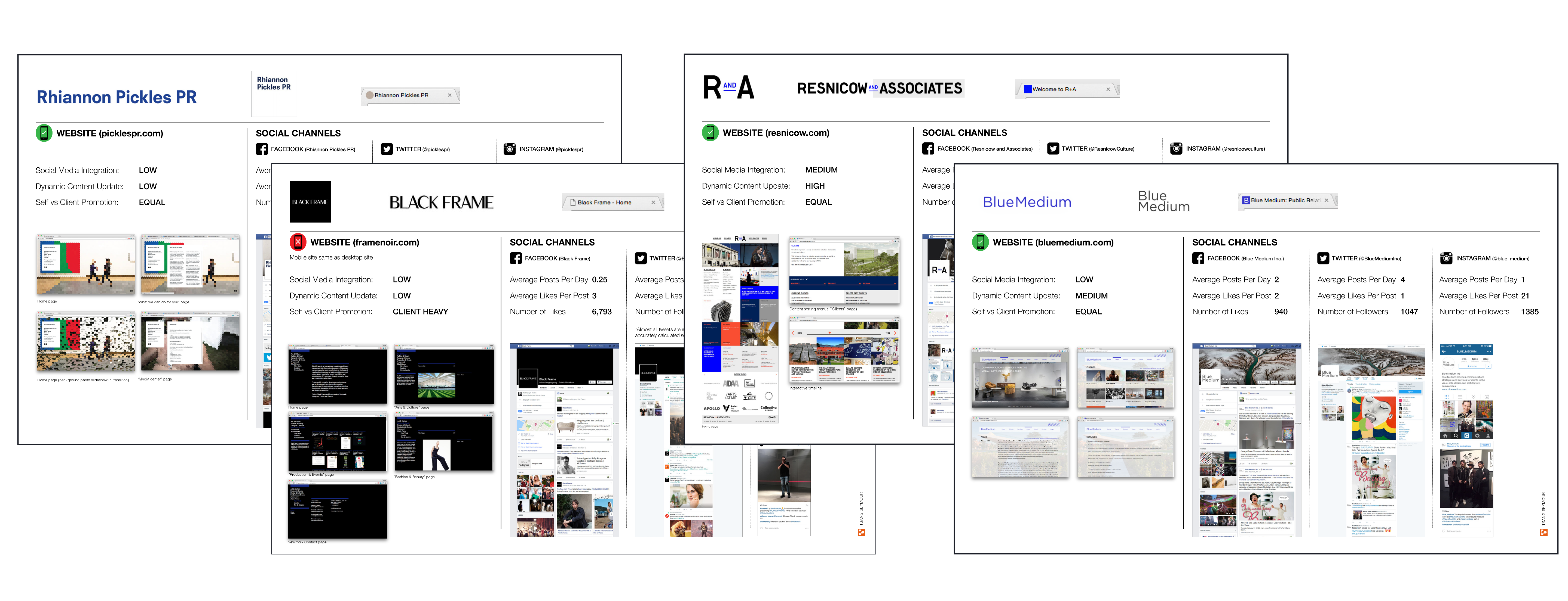
Research I started off with a content strategy meeting with the client discussing what content would go on the website and how we can approach. We did a competitive analysis of their peers and put together a overview of gaps and recommendations.
![]()
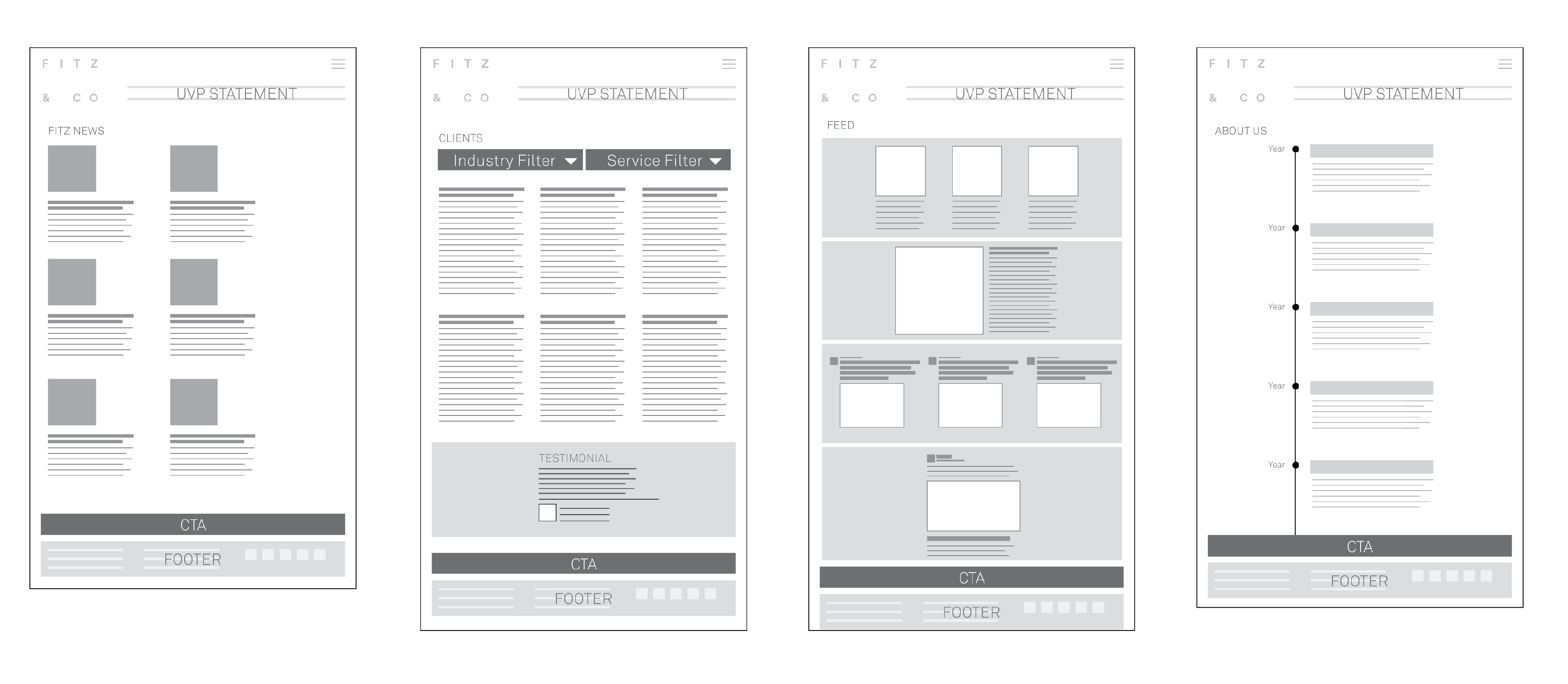
Navigation I created sitemaps and wireframes for the website showing the various pages/navigation and the content distribution.
![]()

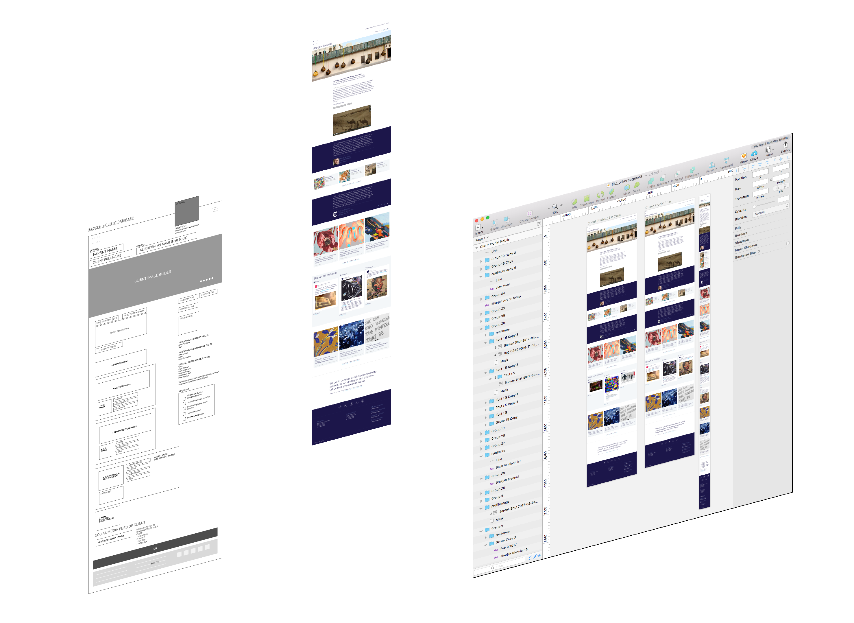
Wireframe We developed wireframes to demonstrate the information distribution and the usability. We also showed a sample test of how the CMS fields on the front-end content with the wordpress back-end.
![]()
Interface Development After getting a go ahead from the client on the wireframes I started building quick prototype for the website, I that will showcase the various interactions, animations and behaviours the website would contain. I developed novel ideas for the website.
![]()
Interactions We developed a customised google map search for their clientele. It could be used as an alternative way to search clients on the website.